by Kate Newton
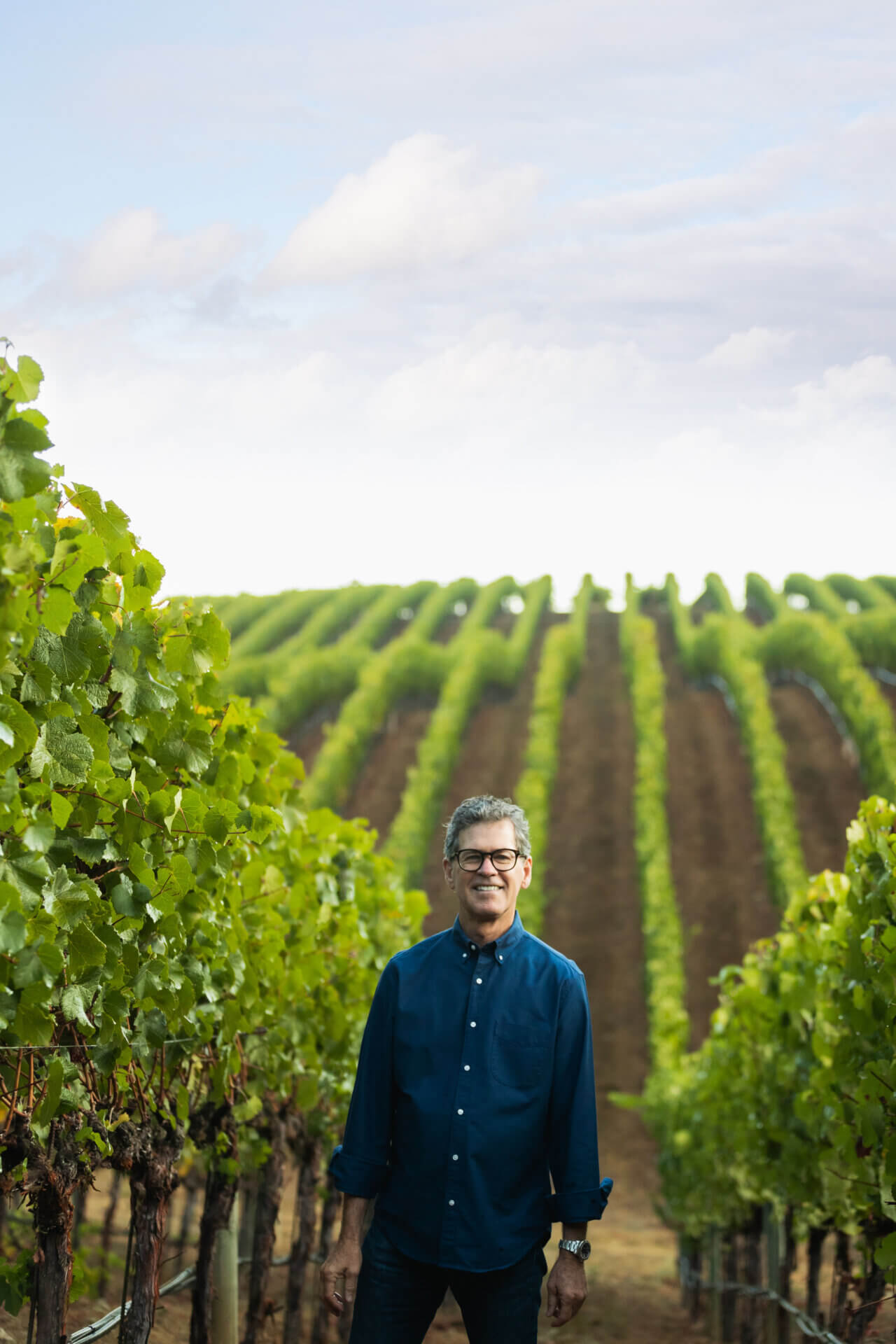
Paul Hobbs has never been the type to surrender to inertia.
In the years since his winemaking career began with an internship at Robert Mondavi in the late 1970s, he’s established his own wineries in California, New York, and Argentina as well as partnerships in Armenia, Spain, and France while engaging in consultant work that’s transported him to vineyards around the world. However, when it came to the packaging for the Sebastopol, California–based Paul Hobbs Winery, which he launched in 1991, he long had a mentality that making major alterations to the classic label bearing his name was far from an urgent task.
Yet the concept that’s inspired the recent redesign of the Appellation, Vineyard Designate, and Cuvée tiers that comprise the portfolio is one that’s been ingrained in Hobbs’ winemaking ideology since the winery’s inception more than 30 years ago: By giving the vineyard or the appellation top billing on the label over the grape variety, Hobbs and his team are explicitly delineating which elements they believe hold the most influence over a given wine’s character. With the old packaging—designed by Chuck House, whose portfolio includes some of Northern California’s most iconic labels— “the varietal had hierarchy over the vineyard, and I was never really in love with that, but that seemed to be the appropriate thing at the time back in 1991 when I started the business,” Hobbs says. “A lot’s changed in 30 years in terms of how appellations are recognized by consumers and obviously the press and trade…We thought, well, when you think of great wines from Europe, and using that model, the vineyard is the place you really want to celebrate. What you choose to grow on it is almost [secondary]. We felt that we were ready to make that change [while] putting more quality and definition into the label itself, more depth, to help the consumer make that distinction quite easily.”
While appealing to the consumer is a driving goal of the redesign, for which the rollout began in February and will finish in July, assisting on-premise beverage professionals is an added benefit. Paul Hobbs Winery launched with a single tier of wines, and as the portfolio expanded, few alterations were made to the packaging to distinguish between them. “So, there was confusion in restaurants, particularly in dark cellars; somebody would order a bottle of Coombsville and end up [getting] a Beckstoffer To Kalon because the server didn’t read the To Kalon Vineyard [on the label],” Hobbs notes. “So those were little additive things that just bubbled up and [made us say], ‘We really need to see what we can do.’ Also, our quality had improved, and there were other [considerations] that [led us to think] the label could be more premium, so we made tweaks to add more definition to the artwork.” They didn’t want to deviate completely from the original packaging, however, so they’ve retained the black label—a choice made back in the ’90s to “take the road less traveled” in a sea of white labels, Hobbs says—against which the signature leaf artwork, now revised slightly to appear more modern, creates a sharp contrast.
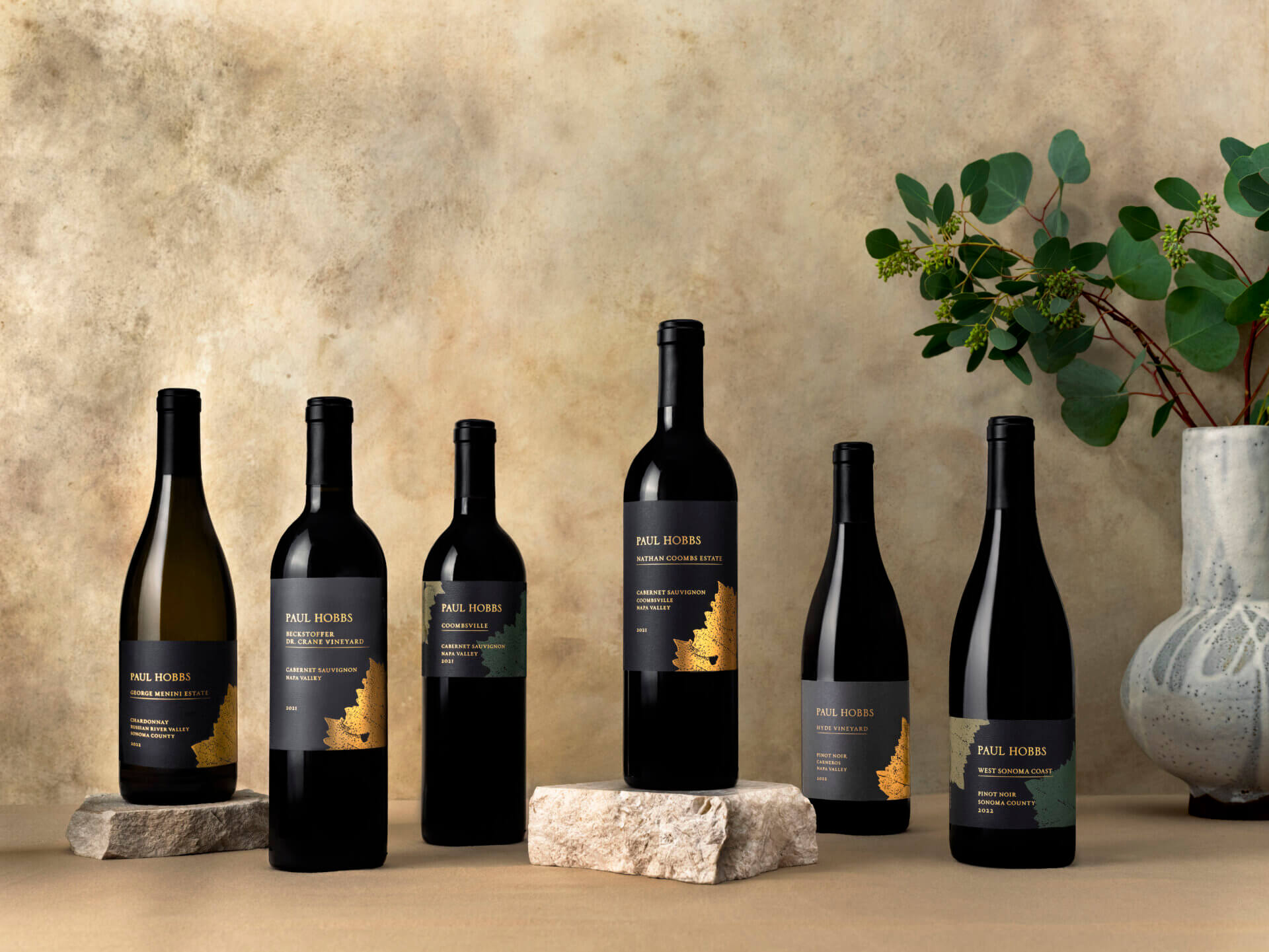
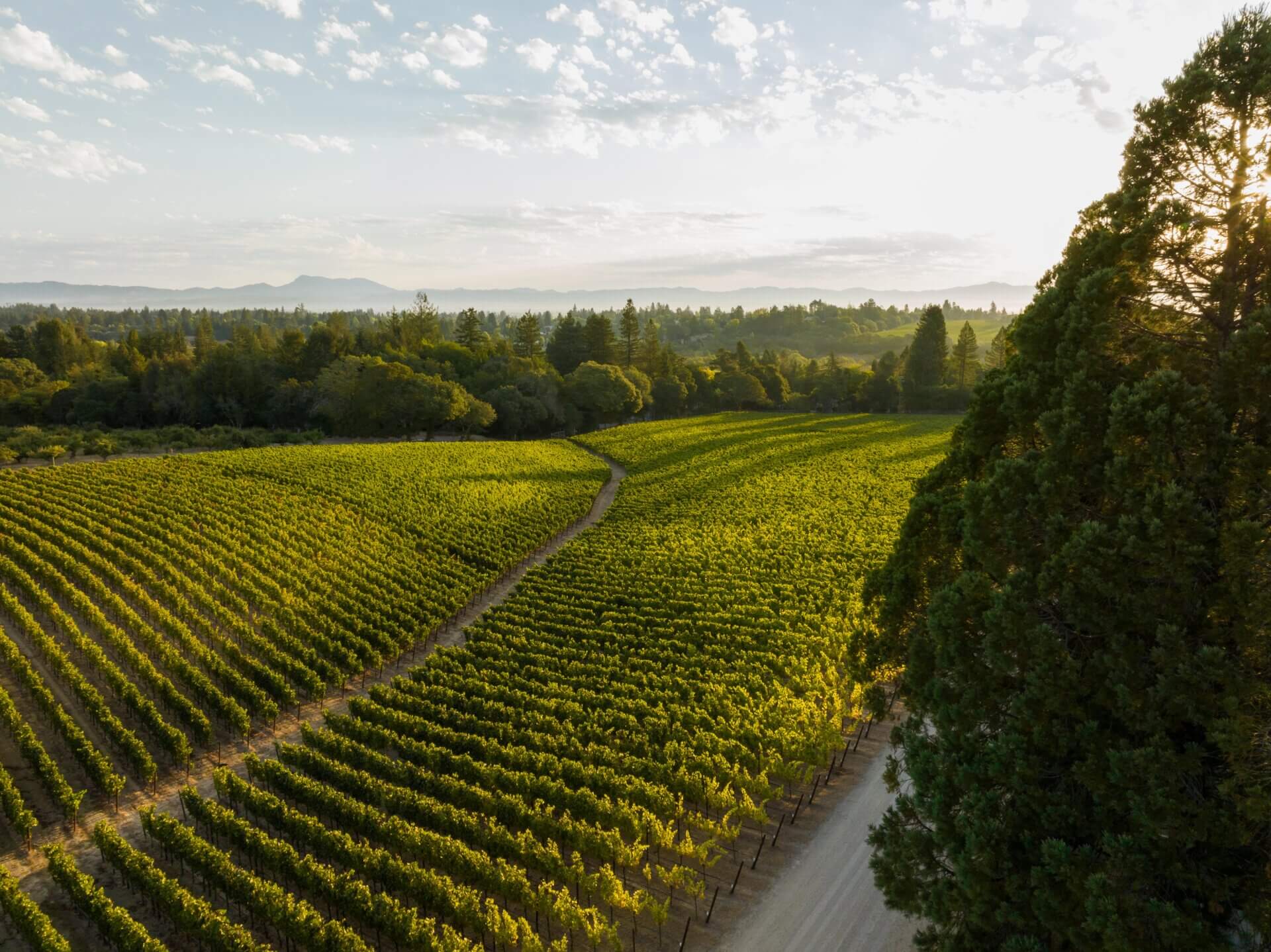
That’s even more so the case with the Vineyard Designate wines, which are emblazoned with a single gold-foil leaf to denote each bottling’s status as a single-vineyard expression, whether it hails from an estate property like Nathan Coombs in Coombsville, Napa Valley, and George Menini in the Sebastopol Hills area of the Russian River Valley or a partner site like Napa’s Beckstoffer Dr. Crane Vineyard. Hobbs’ long-established propensity for vineyard-designate wines can be traced back to his travels to Burgundy in the 1980s, and since its launch, the Paul Hobbs Winery label has served as a conduit for that passion—one that’s increasingly being shared by consumers, much to Hobbs’ pleasure. “The name of the vineyard and building the reputation of the vineyard, you could see from the European model, particularly the Burgundian model, how important that was. And we thought that would occur as a region tends to mature. When I first came to the Russian River district, for example, and West [Sonoma County], it was just sort of beginning to be known but we could see that as these labels went out into the market and as we learned more and consumers learned more, how it added value as an asset of the whole proposition of the wine we were selling,” he explains. “The vineyard became extremely important to us, and there was no surprise in that. We have clients [who,] when they’re drinking our portfolio, they love to try all of them and see how they differ, and that just continues to grow and build. I think we’re still in the infancy of that and just scratching the surface.”
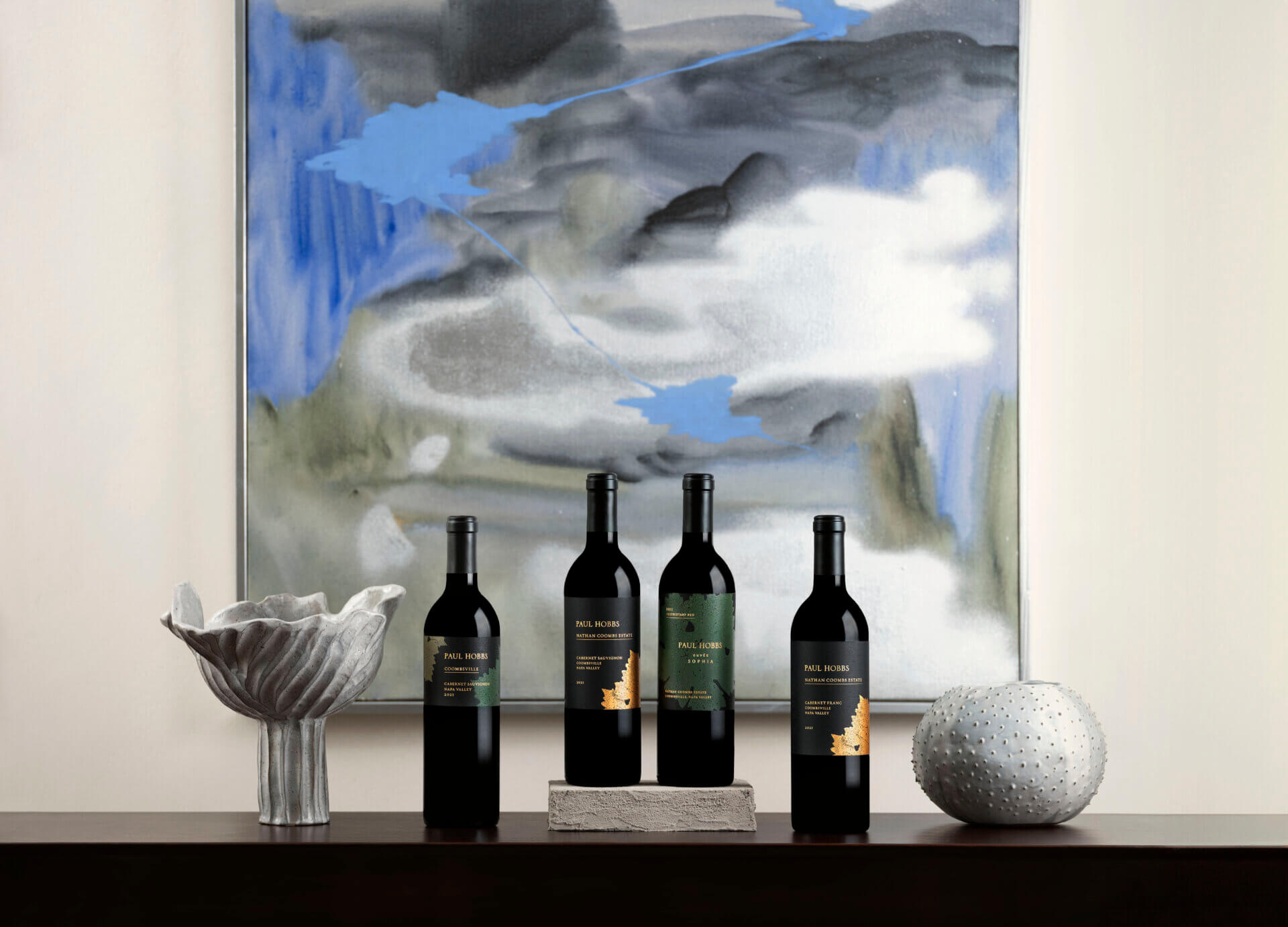
Those interested in delving well below the surface can join Paul Hobbs’ mailing list, through which they can gain exclusive access to the winery’s Cuvée collection; the enlarged leaf artwork on its new labels compared to that on the other tiers signifies its place at the pinnacle of the portfolio due to the wines’ “rarity and exclusivity,” in that they represent specific blocks within Paul Hobbs’ most esteemed sites, Hobbs notes. “These are ultra-luxury products—a culmination of all my years of working experience,” he adds.
Regardless of which tier his customers are exploring, Hobbs is particularly excited to witness the potential the new packaging has for generating interest in Paul Hobbs’ “key four” estates, namely the aforementioned Nathan Coombs and George Menini as well as Goldrock in West Sonoma Coast and Katherine Lindsay, the winery’s original estate, in the Russian River Valley. “I didn’t have an estate vineyard planted until 2000, so I wasn’t able to really get into the game of growing my own grapes until a good nine, ten years after starting the company. Now we have a bevy of our own estates, and we have these great, pedigreed properties. So, I think what we’ve done here is going to elevate the awareness of these estates in the mind of the consumer,” he says, while potentially inspiring the more dedicated enophiles to eventually visit the sites themselves.
He has similar hopes for Paul Hobbs’ partner vineyards, some of which he’s had relationships with for decades, among them Hyde, Richard Dinner, and Beckstoffer. “These relationships [with growers,] they’re deep relationships, which I think is important in this business because there’s an intuition, and you want people who are really and truly engaged emotionally,” he says. “When there’s [that] emotional connection, the vines seem to somehow respond to that”—creating a sense of place in the newly enhanced wines that, in Hobbs’ words, “has tremendous power.” “We want a legacy; we want this thing to go on,” he continues. “This [redesign] is that legacy. While the quality of wine you have come to expect from Paul Hobbs remains the same, we hope that when you pick up a bottle now, it will evoke a clearer sense of the wine inside—a focused but complex expression of a singular place.”
The On-Premise Impression
“I am a longtime fan of [Paul Hobbs’] wines and have been utilizing them extensively during my tenure with Landry’s[, La Griglia’s parent company]. I appreciate how much care the winery is taking with these timeless labels and am excited to see the new vintage. In my opinion, the decision to emphasize appellation and vineyard site on the new labels is an excellent move. When selling the 2019 Paul Hobbs Coombsville Napa Valley Cabernet Sauvignon (which I have poured by the glass at two restaurants), I often find my guests somewhat confused by the packaging[, and as a result] I often have to clarify where the wine comes from and where it stands within the portfolio. This new label will make it much easier for my guests to understand exactly which wine they are enjoying when I present it to the table. Furthermore, I think the decision to keep Napa Valley on the front label is a necessary one, as Coombsville is still an appellation many wine lovers in Houston are not immediately familiar with.” —Skyler Ring, wine director, La Griglia, Houston, Texas

We love the new labels. They are immediately recognizable as the familiar Paul Hobbs brand, but the vineyard names being more prominently displayed makes it much easier to navigate the many wines of the Paul Hobbs ecosystem. [They’re] very user-friendly to [both] the consumer and the restaurant and retail staffs that manage physical inventory.” —Francis Schott, co-owner, Stage Left Wine, New Brunswick, New Jersey